Timeline
Jan 2023—Jan 2025
Team
Design lead · Tech lead · Product designer (me) · Engineering (2)
Classification
1. Intro
Cogs is Cognite’s internal design system, used across product teams to support consistency, scalability, and collaboration.
When the work began, the system existed in name but not in practice. Components were missing or inconsistent, documentation was fragmented, and processes were rigid. Teams worked largely in silos. While the technical infrastructure was in place through Figma libraries and partial guidelines, trust in the system was not.
The task was to build the components teams actually needed and shape the system into something they could rely on day to day.
The challenge
A system only works when it’s worth using. It earns its place through reliability and collaboration.
This required building the components teams actually needed while creating the practices that would make those components stick. The goal was making the system the fastest path to good work, not an obstacle to it.

2. What it did
Component adoption increased roughly 20% across teams. Designers started reaching out for patterns instead of building one-offs; the system became the default, not the exception.
System Usability Scores (SUS) improved 15% over three years as design system became more consistent and predictable.
Strengthened cross-functional collaboration. Teams engaged beyond component usage: contributing ideas, participating in critiques, and treating feedback as everyday work rather than formal review.
3. The system
Built on clarity and collaboration rather than enforcement. Teaching happened inside the work itself. Critiques and reviews translated intuition into shared reasoning and made quality decisions something teams could learn, not simply execute.
Foundations
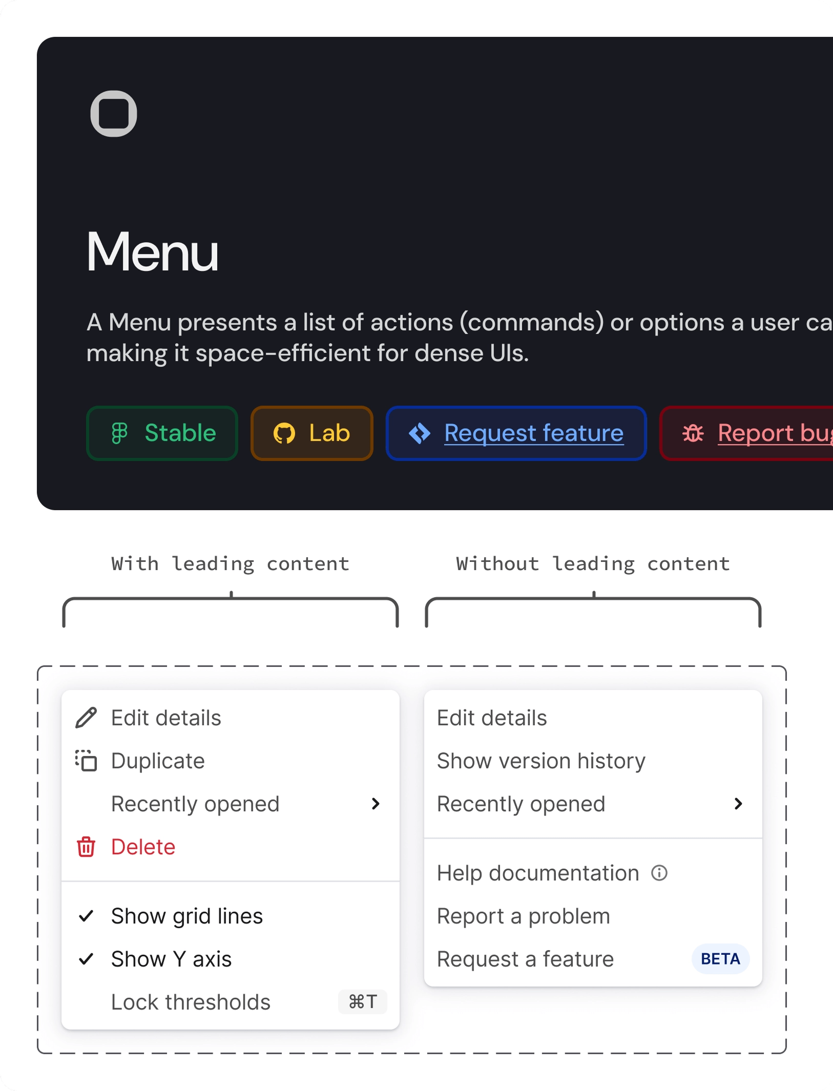
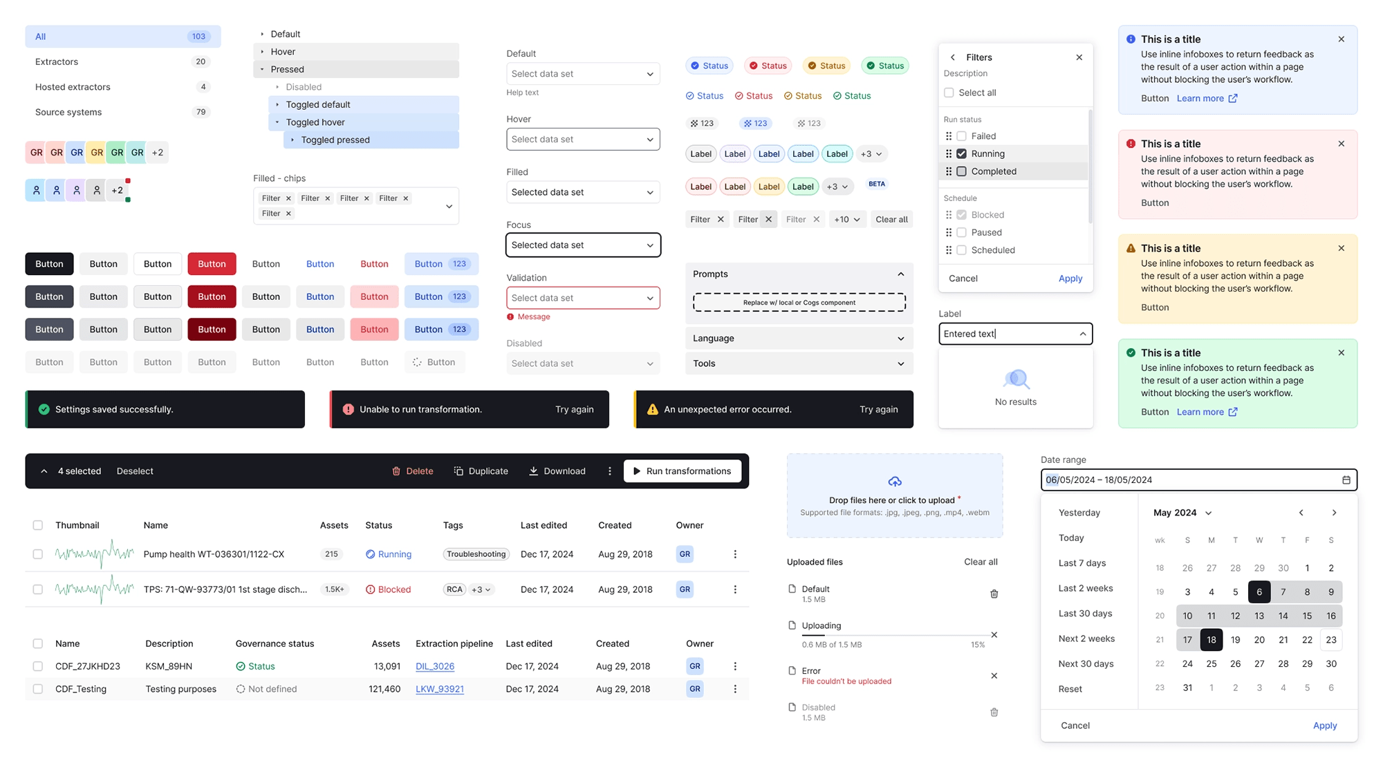
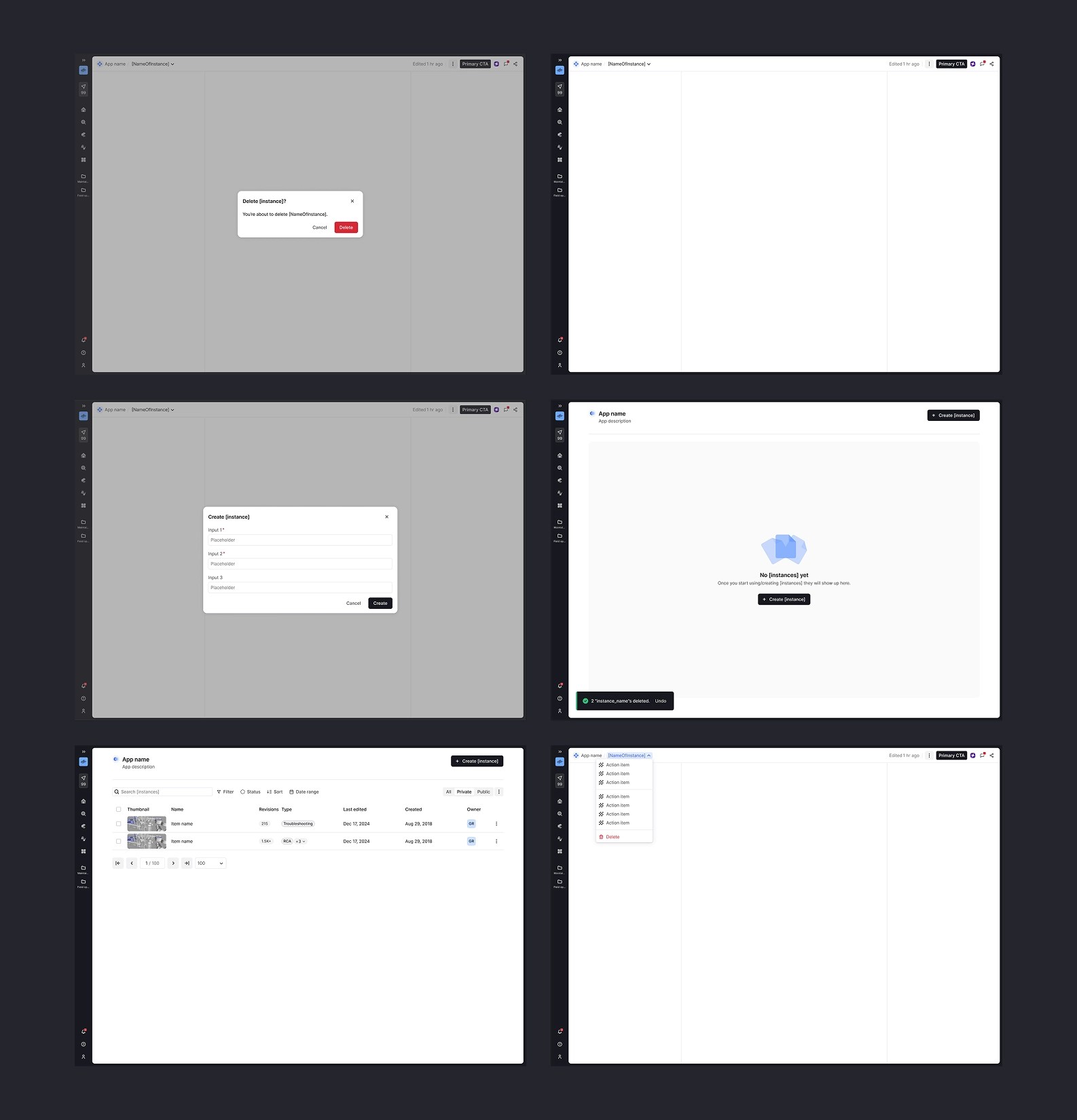
The work began with an audit to identify gaps and inconsistencies. We rebuilt the Figma library with a semantic token structure, robust variant systems, and a clearly defined component lifecycle. I developed new color palettes, both semantic and decorative, with accessibility treated as a baseline rather than an afterthought.
I worked closely with developers to align design decisions with implementation, ensuring what we designed translated cleanly into production. In total, we delivered more than 60 components in design and code, with WCAG AA compliance built in.

Building the practice
We treated use as a design problem in its own right. Instead of formal rollout processes, we focused on practices that embedded the system into everyday work. Key practices included:
Structured critiques
We paired designers who did not normally work together for focused critique sessions centered on component usage, information architecture, and system reuse. The format proved durable where earlier attempts had faded and played a central role in reducing silos through dialogue.
Ongoing consultation
Product teams scheduled recurring working sessions for critique, problem solving, and identifying when the system needed to evolve. Over time, this normalized asking for feedback as part of everyday work.
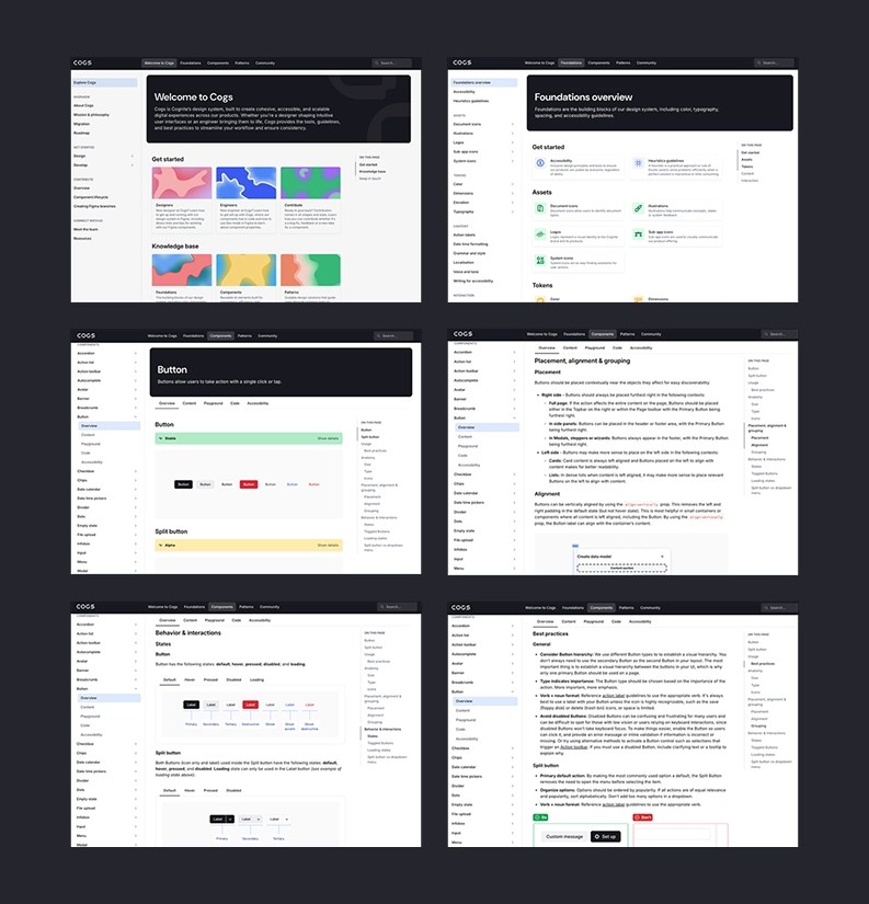
Design system newsletter
I maintained a regular newsletter shared in Slack that surfaced newly released components in design and code, highlighted feature launches, and included short tips based on recurring questions. Teams referenced it frequently, increasing visibility and reinforcing the system as a living resource.


4. Why it worked
Designers did not trade craft for consistency. Components felt considered and well made. The system supported both.
Engagement grew because critiques felt constructive, asking for help felt natural, and the system functioned as an enabler supported by clear examples rather than enforcement.
Progress was incremental. Early wins established credibility, followed by deeper refinements that raised the baseline over time without disruption.
5. My role
I worked as a design system designer for over two years, partnering with the design system lead on strategic decisions while focusing on component and token design, Figma library architecture, visual refinement, documentation standards, and cross-team collaboration.
The work included designing and building complete component libraries with developers, establishing practices that made the system accessible, running critiques and consultation sessions, and ensuring what we built shipped with quality intact.