
Timeline
March 2022—Aug 2022
Team
Product lead · Tech lead · Design (me) · Engineering (3)
Classification
1. Intro
Karus had built a sophisticated AI engine for auto lending, but no one could see it, or touch it. The technology was making million-dollar decisions behind the scenes. What was missing: an interface people could actually use, and a brand that could carry it into one of the most risk-averse industries in finance.
Our job was to give intelligence a familiar face.
The challenge
Auto finance is conservative. Lenders want proven, familiar, bulletproof. The platform needed to feel unmistakably more advanced without disrupting the mental models people relied on.
It was about translation: making AI feel like trustworthy, not trend following. Something decision-makers could stake seven-figure loans on.

2. What it did
Defined the foundations for Karus’s commercial platform: product interface, visual identity, and brand language, within a six-month build.
Provided a stable base as the platform grew to 73,000+ users and $30M+ in originated loans.
Held up over time, allowing the navigation model and visual language to scale without requiring redesign.
3. Creative system
Built around a metaphor of precision under pressure, creating a visual language that felt sharp and unquestionable.
The diamond principle
We began with the name: Karus, derived from the Latin for “precious” or “valued.” That led us to diamonds, not as decoration or symbolism, but as a working metaphor for how the platform should behave.
Diamonds are formed under pressure. They are precise, multifaceted, and unambiguous. Structure becomes visible only when light hits them correctly. This became a filter for every creative decision: does this add clarity or noise? Does it sharpen understanding or soften it? Can it carry the weight of a seven-figure lending decision?
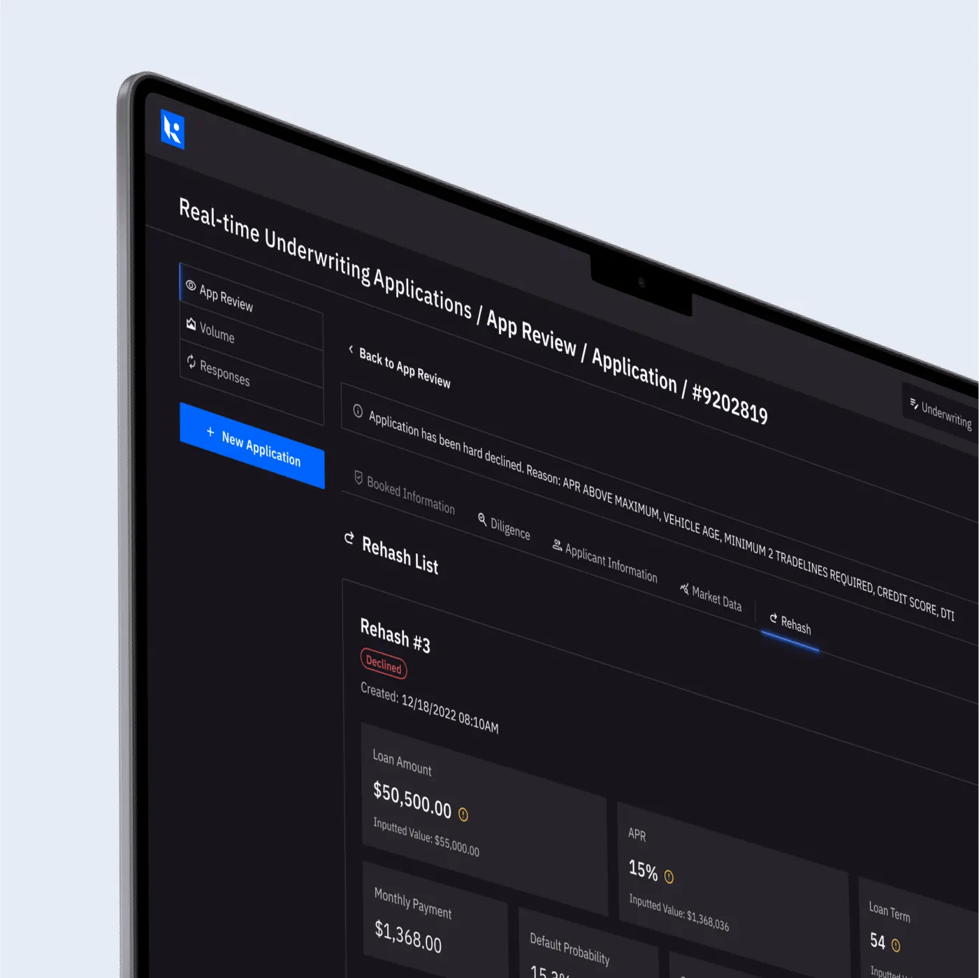
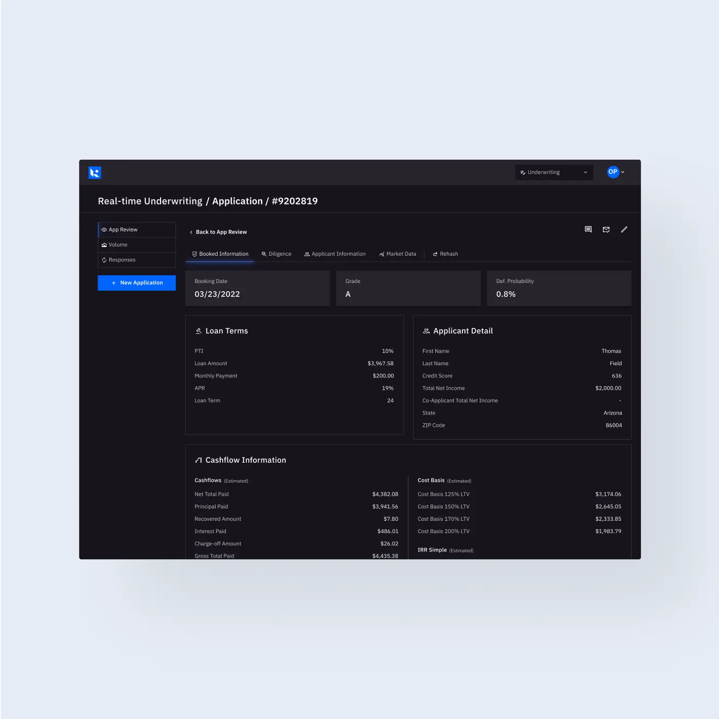
Typography: built for verdicts
The interface depended on numbers being read quickly and correctly, across dense tables and high-stakes contexts. Typography was tested explicitly for optical clarity at small sizes: open counters, distinct character shapes, sharp terminals.
The selected type family (IBM Plex Sans) performed consistently from 10px data labels to large dashboard headings. Every number needed to read like a verdict, not a suggestion. In auto finance, a misread digit is not a UX issue, it is a financial liability.
Functional color palette
The palette was designed for work, not impression. Blues signaled trust without nostalgia. Neutrals carried sufficient contrast to meet WCAG standards at small sizes. Accent colors were engineered to differentiate multiple concurrent data series without overwhelming the interface.
We prioritized dark mode, where users spend most of their time, and as a deliberate departure from the default white-table finance tools. The color system was built to scale across chart types, data states, and edge cases without constant recalibration. We introducing seven additional hues alongside the primary palette, each with ten controlled lightness variants.
Scalable composition
Layouts were angular and deliberate. White space was structural rather than expressive. Grid systems flexed without breaking.
We avoided the AI industry’s tendency toward glossy futurism. Instead, we built something that felt like it had always been there, just sharper than everything else in the room. The platform doesn’t announce itself. It accumulates authority through small, consistent decisions, the way trust does in conservative industries.
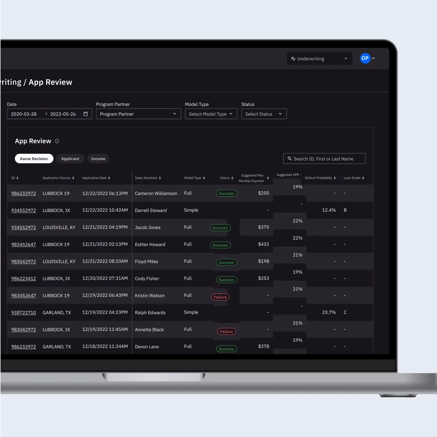
4. Product structure
Early explorations showed single-sidebar layouts collapsing under data volume. We designed a dual-navigation model: one axis for exploration, one for examination. This created natural hierarchy and gave the platform room to grow without architectural rewrites.
The structure still holds three years later, even as the feature set has doubled.
5. My role
I led creative strategy, product architecture, and brand development—working across navigation patterns, visual identity, typography and color systems, dashboard structure, user research with lenders, and collaborating with engineering on real-time data flow.
